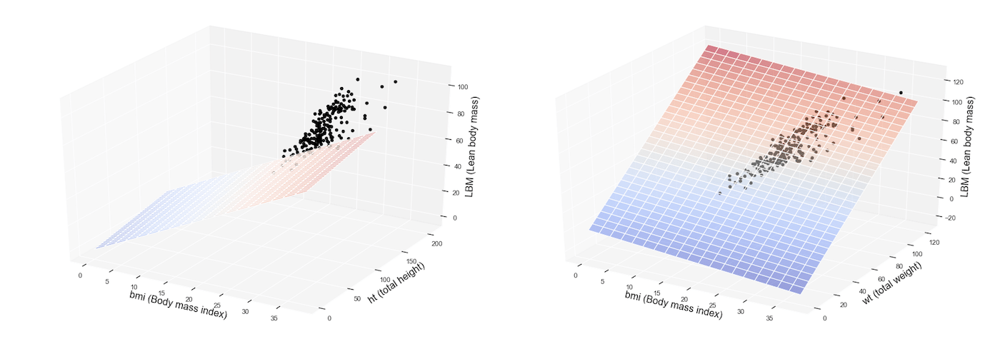
In the previous post we have analyzed an example of simple linear regression: a set of machine learning algorithms and techniques able to predict an output variable given a single independent variable, therefore through a linear function like Y = c1 + c2X.
Today we are going to see its advanced extension, that is: how to predict Y as a function of multiple linear independent variables (X1, X2, X3 etc … etc …). This type of model is also called multiple linear regression (MLR).
We can reuse the dataset relating to blood tests carried out on Australian professional athletes related to various sports few years ago: reference Telford, R.D. and Cunningham, R.B. 1991 – sex, sport and dependence of hematology on body dimensions in highly trained athletes. Sports medicine and science 23: 788-794.
The dataset contains 13 features related to 202 observations.

Here is the feature description:
rcc: red blood cell count, in
wcc: white blood cell count, in per liter
hc: hematocrit, percent
hg: hemaglobin concentration, in g per decaliter
ferr: plasma ferritins, ng
bmi: Body mass index, kg
ssf: sum of skin folds
pcBfat: percent Body fat
lbm: lean body mass, kg
ht: height, cm
wt: total weight, kg
sex: f or m
sport:B_Ball Field Gym Netball Row Swim T_400m T_Sprnt Tennis W_Polo
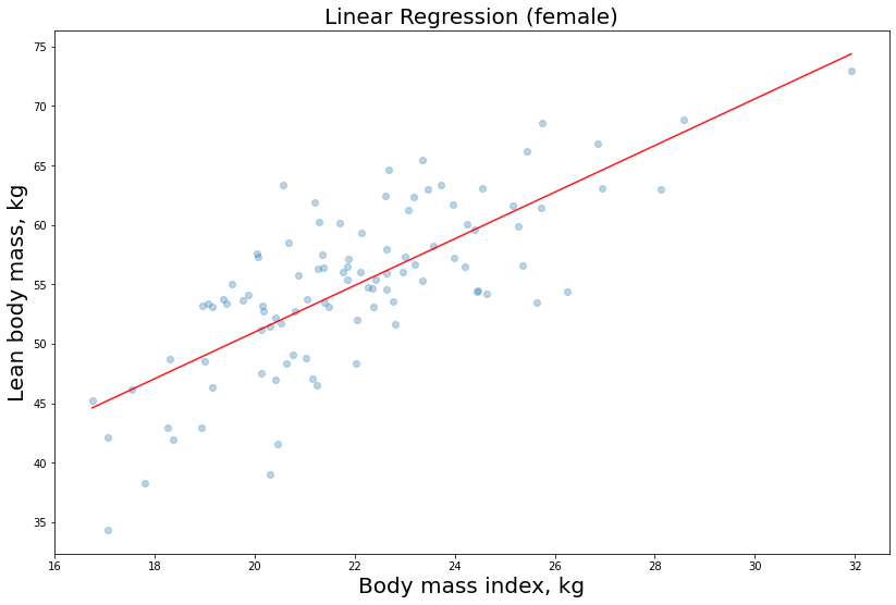
In the previous post we used the linear regression model to estimate the labeled feature lbm as a function of the independent variable bmi (simple regression). We used the following estimator provided by scikit-learn:
model = sm.OLS(y, X)
As a result, we got the regression lines related to our predictions.
Here we are with the female athletes regression function chart:
Let’s now try to fit the same model, but this time we use two independent variables, namely X1 = bmi and X2 = wt, to predict y = lbm
Let’s proceed with the training phase:
To_be_predicted
y1_male = df_male[‘lbm’]
Intependent vars
X1_male = df_male[[‘bmi’,’wt’]]
Add constant to better fit the linear model
X1_male = sm.add_constant(X1_male.to_numpy())
model = sm.OLS(y1_male, X1_male)
model = model.fit()
Let’s see the accuracy, R2 and p-value results:
| Dep. Variable: | lbm | R-squared: | 0.949 |
|---|---|---|---|
| Model: | OLS | Adj. R-squared: | 0.948 |
| Method: | Least Squares | F-statistic: | 917.8 |
| Date: | Fri, 15 May 2020 | Prob (F-statistic): | 1.25e-64 |
| Time: | 14:38:14 | Log-Likelihood: | -226.33 |
| No. Observations: | 102 | AIC: | 458.7 |
| Df Residuals: | 99 | BIC: | 466.5 |
| Df Model: | 2 | ||
| Covariance Type: | nonrobust |
| coef | std err | t | P>|t| | [0.025 | 0.975] | |
|---|---|---|---|---|---|---|
| const | 15.6579 | 1.968 | 7.956 | 0.000 | 11.753 | 19.563 |
| x1 | -0.5647 | 0.148 | -3.820 | 0.000 | -0.858 | -0.271 |
| x2 | 0.8785 | 0.033 | 26.641 | 0.000 | 0.813 | 0.944 |
| Omnibus: | 26.701 | Durbin-Watson: | 1.686 |
|---|---|---|---|
| Prob(Omnibus): | 0.000 | Jarque-Bera (JB): | 56.728 |
| Skew: | -0.995 | Prob(JB): | 4.80e-13 |
| Kurtosis: | 6.064 | Cond. No. | 765. |
This time the Adjusted R-square parameter is significant, because we are dealing with a multiple linear regression (MLR). Remember that if R tends to zero it means that our model does not explain the training data well, while the closer it is to one, the more the linear coefficients are able to follow the observations.
0.948 is an excellent result!
We can also print the coefficients and p-values:
print(“linear coefficients:\r”,model.params)
print(“p-value:\r”,model.pvalues)
const    15.657902:
x1       -0.564722
x2        0.878512

const    2.975861e-12
x1       2.326238e-04
x2       6.007130e-47
p-values are all below 0.01 so our coefficients are statistically reliable.
Now we want to visualize our model graphically. Since we have two independent variables, this time the graph will not be a simple straight line, but a surface or a plane plotted inside a three-dimensional space.
Here it is how we can print the multiple regression model (for sake of simplicity we have not split the data between males and females in this case):
from mpl_toolkits.mplot3d import Axes3D
from matplotlib import cm
df = pd.read_csv(‘http://gosmar.eu/ml/ais.csv’, index_col=0)
#To_be_predicted
y = df[‘lbm’]
#Intependent vars
X = df[[‘bmi’,’wt’]]
model=sm.OLS(y, X)
fit = model.fit()
fit.summary()
fig = plt.figure()
fig.subplots_adjust(top=2.0, right = 2.0)
ax = fig.add_subplot(111, projection=’3d’,facecolor=’white’)
x_surface = np.arange(0, 40, 2) # generate a mesh
y_surface = np.arange(0, 124, 4)
x_surface, y_surface = np.meshgrid(x_surface, y_surface)
exog = pd.core.frame.DataFrame({‘bmi’: x_surface.ravel(), ‘wt’: y_surface.ravel()})
out = fit.predict(exog = exog)
ax.plot_surface(x_surface, y_surface,
out.values.reshape(x_surface.shape), cmap=cm.coolwarm,
rstride=1,
cstride=1,
color=’none’,
alpha = 0.5)
ax.scatter(df[‘bmi’], df[‘wt’], df[‘lbm’],
c=’black’,
marker=’o’,
alpha=1)
ax.set_xlabel(‘bmi (Body mass index)’,fontsize=16)
ax.set_ylabel(‘wt (total weight)’, fontsize=16)
ax.set_zlabel(‘LBM (Lean body mass)’, fontsize=16)
plt.show()
Here you are with the result!
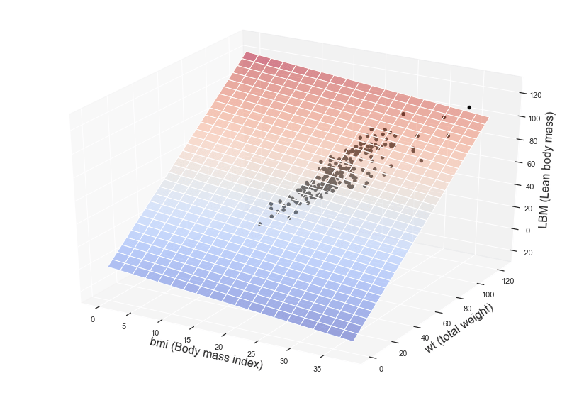
The colored surface represents our multiple regression model, that is the predictions or inferences, while the dots are related to the observations available inside the training dataset.
Interested in learning more about Machine Learning and AI applications?
Here you can find a book about it:
https://www.amazon.com/dp/B08GFL6NVM
